general description
The Management Information System (VIR) is a software used by managers of healthcare facilities to monitor and manage the operations of their facility. With VIR, managers can see patient booking trends, physician utilization, service utilization, and other important information. Analyzing and interpreting data helps managers to make the operation of the institution more efficient and improve patient care. VIR enables managers to proactively and effectively address challenges and helps healthcare facilities stay competitive in the industry.
Settings
Filters
In VIR, the relative date filter allows users to select data within a specific time period. Users can set individual time intervals that allow more precise definition of the desired period. The relative date filter is extremely useful for dynamic data analysis and allows users to quickly view data for a selected time period.
Relative date filter
This filter is easy to use, click to open the drop-down menus, select the desired settings, or enter the desired quantity if applicable.
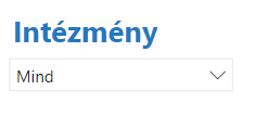
Institution filter
The institution filter is an important element of VIR, which allows users to display data belonging to a given institution. The institution filter allows the selection of individual institutions using a drop-down menu, where the user can select the institutions for which they are interested in data. By default, the institution filter displays data from all institutions.
Specialty filter
The VIR specialty filter allows you to filter bookings belonging to a given specialty. To use the filter, the user must select the desired field of expertise from the drop-down menu. After selecting the field of expertise, all data is narrowed down to bookings belonging to the selected field of expertise. Using the filter helps users get more accurate information about the specific field.

Not a filter
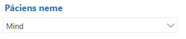
The gender filter in the VIR system allows users to filter data by patient gender. The gender filter has a drop-down menu with the options 'Male', 'Female' and 'Not Specified'. If the user selects an option, the data is automatically updated and only the data of patients belonging to the selected gender are displayed.
Tables
Simple tables
The tables in VIR are interactive and allow the user to examine and filter data. By clicking on the data in the tables, the given cell or row is highlighted, which helps the user to distinguish the data. You can sort the data by clicking on the header columns in the tables.
Matrix tables
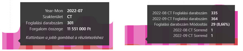
These tables differ from simple tables in that each line has an extra button, which you can click to expand the given line to get even more detailed information.
Charts
Bar graph
The bar chart data in VIR is usually about the performance of individual specialties, doctors or institutions. The data displayed on the X and Y axes can be used to compare different values and make the data easy to interpret. Bar charts are interactive, the displayed data changes by clicking on them. More information is available by moving the cursor over each column.
Pie chart
VIR's pie charts display the data proportionally to form a circle, where the full circle represents 100%. The pie charts color code the categories, making the data easy to understand. The circle shape allows for quick and easy comparison of relative proportions. VIR's pie charts are interactive and offer the opportunity to filter and view detailed data.
Bar chart
A VIR bar chart shows changes over time for a given measure or characteristic. In the diagram, the periods are divided into months, and values given in each period are plotted. In the diagram, the ribbons represent the values of the measure or characteristic, while the time axis runs below the ribbons. These types of charts can be very useful for analyzing trends or seasonality and identifying outliers or unusual values in specific periods. The use of the diagram can help healthcare institutions to make their operations more efficient and improve patient care.
If you move the cursor over the columns or the ribbons connecting them, more information is displayed.
Buttons
You can easily navigate between the views using the arrows in the lower corners of the views, they can be used to go to the next or previous view. These buttons can be found on all views.
OPERATION
Dashboard
general description
The VIR Dashboard view provides an overview of the data in the system. The data is displayed in daily, weekly and monthly breakdowns for the current month. The view includes bar graphs and buttons that the user can use to display various statistics and summary data. The bar graphs are interactive and additional information can be displayed by clicking. With the help of the view, users can easily and quickly get an overview of the system data.
Statements
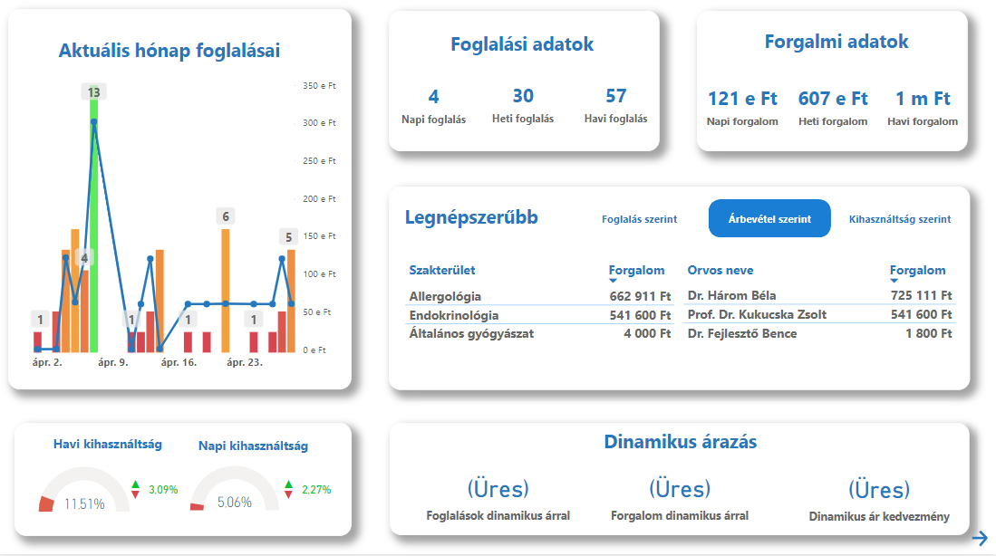
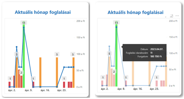
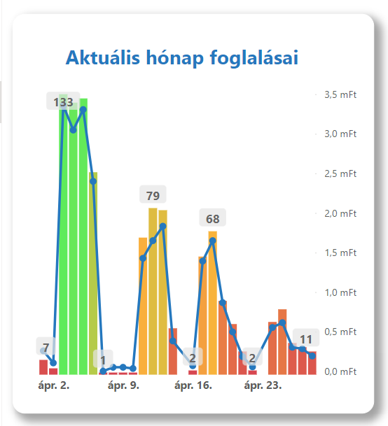
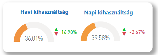
One of the most important elements of the view is a bar chart, which shows the date on the X axis, and the number of bookings on the Y axis, as well as the financial flow from bookings. The columns show the number of bookings, and the blue line indicates traffic.
Below the bar chart there is an indicator, which gives insight into the daily and monthly utilization rates and their changes. If the change compared to the previous month or day is positive, the change is displayed in green, if negative, in red.
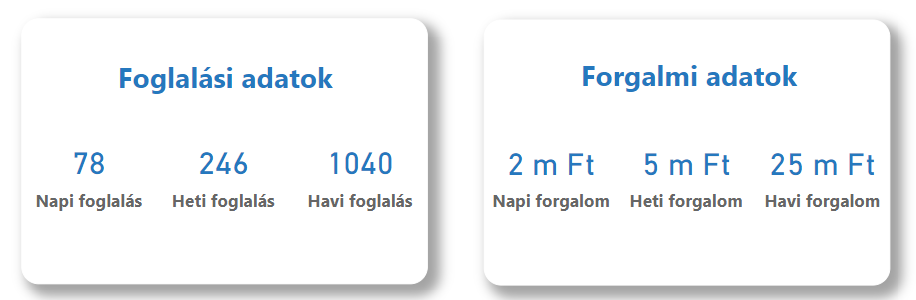
In the upper right part of the view, you can see the current booking and traffic data broken down daily, weekly and monthly.
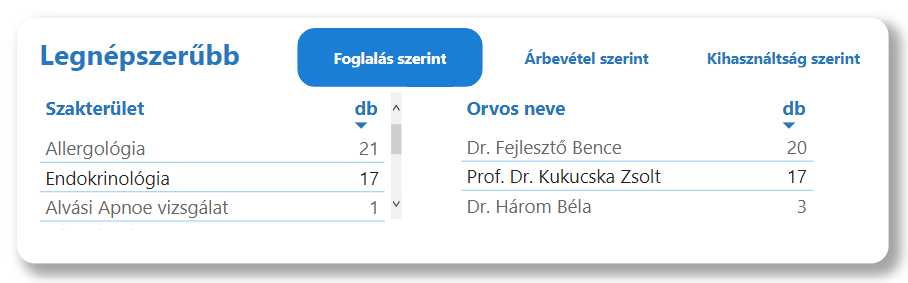
The next element of the view is the so-called "Most Popular" figure, where the first three specialties and doctors are visible. With the help of the buttons, you can switch to examine them according to the number of bookings, sales or utilization.
The last element of the view is a diagram related to Dynamic Pricing. This includes the number of reservations made with dynamic pricing for the current month, the financial turnover generated with dynamic pricing and the financial size of all discounts generated with dynamic pricing.
The essence of the Dynamic Pricing method is that we do not offer the vast majority of services at fixed prices, but instead apply variable prices depending on occupancy and the proximity of the time.

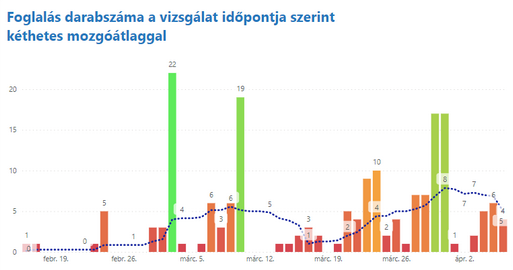
Basic data (according to examination date)
general description
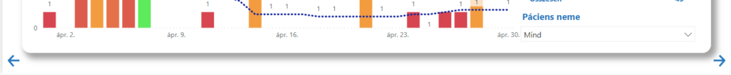
The Basic Data (By Test Date) view in the VIR system is a data analysis tool that allows institutions to review and evaluate test bookings by date. There are many interactive elements on this view, including a dynamic date filter, an institution filter, and a specialty filter. It displays the data in a bar graph and a table, all of which can be influenced by the settings of the specific filters. The column chart shows the number of bookings, the moving average of which is also displayed by the system. The table shows the number of bookings received for each examination, depending on the specific filters. Among the filters, there is also a gender filter, which allows you to filter the data based on the gender of the patients.
Statements
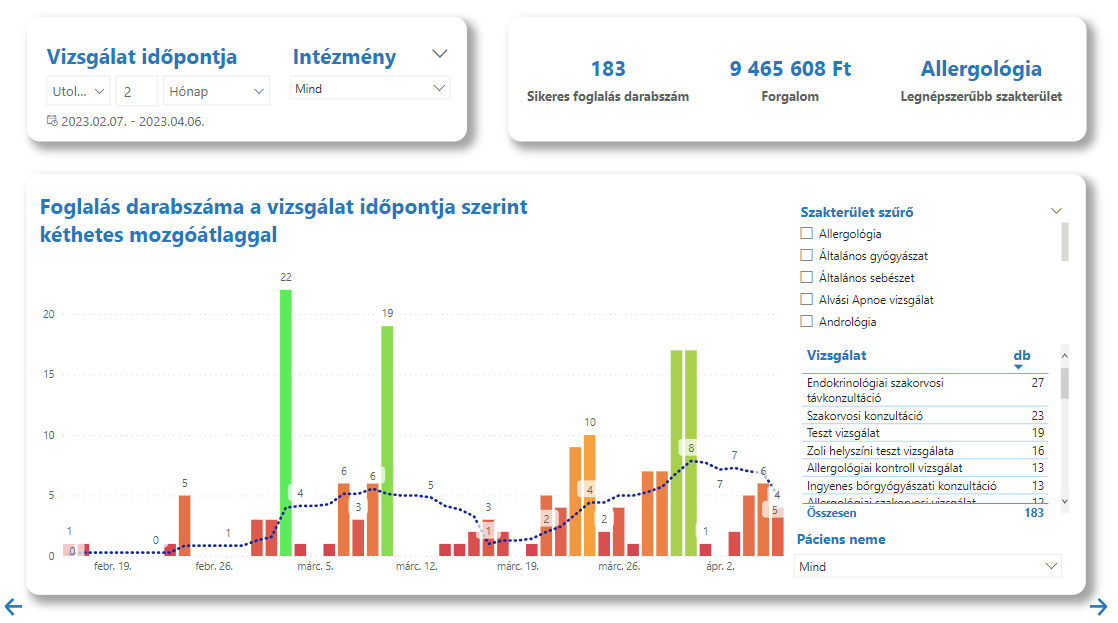
The main element of the view is a bar chart showing the number of bookings according to the time of the inspection. This chart also includes a two-week moving average.
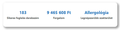
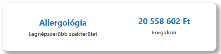
In the upper right corner, there is a summary diagram with the most important data: the number of successful bookings, the resulting traffic and the most popular specialty.
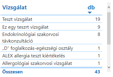
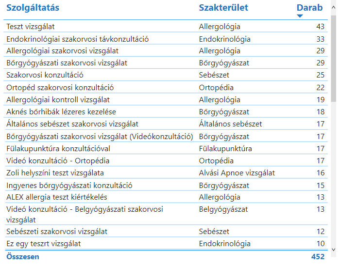
On the right side of the view, under the specialty filter, there is a table where you can see the names of the examinations booked at the given time and the corresponding number of bookings.
The other elements on the view are filters, more about them here you can read.
Basic data (according to booking date)
general description
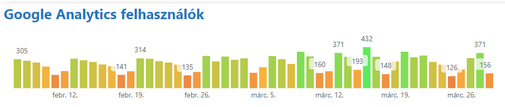
The VIR Basic Data (by Booking Date) view shows the detailed data of the bookings according to the booking date, as well as data on Google Analytics users.
Statements
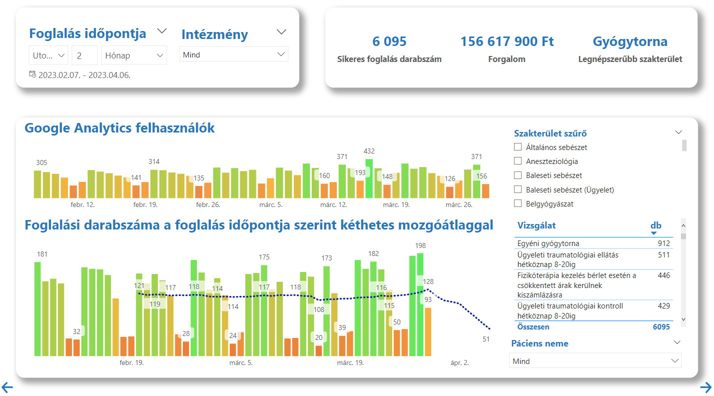
Compared to the previous view, the only difference is a bar chart showing the number of Google Analytics users in the selected time interval.
Reservation source rates
general description
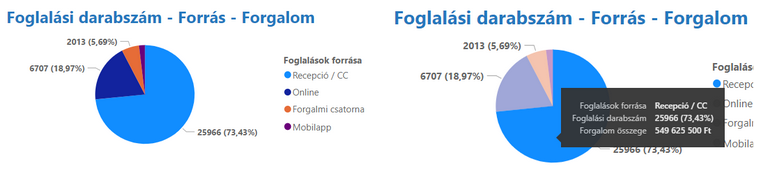
The "Booking source ratios" view shows the ratios of the different sources of the bookings in the VIR system. The view contains two pie charts where the proportions of bookings and Google Analytics sources can be read. Next to the charts is a table with more detailed information about each service, such as the number of bookings associated with it. The view provides useful information about the efficiency of booking sources and helps to optimize the workflow.
Statements
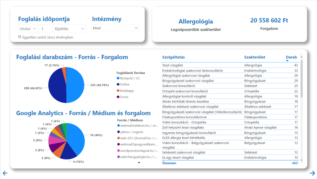
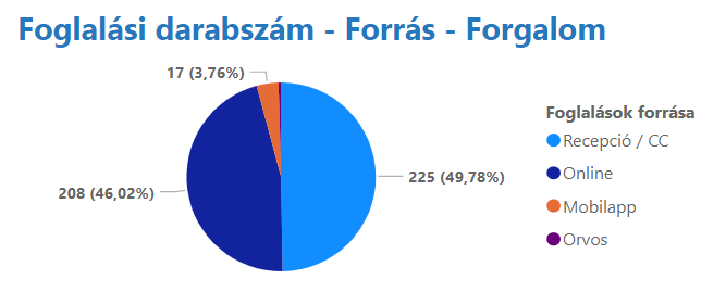
On the upper pie chart in the view, you can observe the distribution of the reservation numbers, with both percentage and numerical values. You can also get an insight into the traffic by dragging the cursor over the diagram.
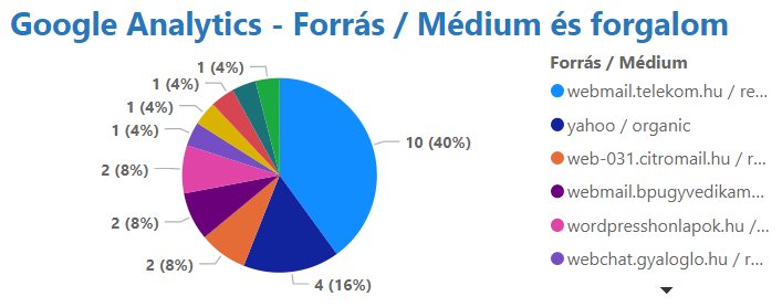
From the other pie chart, you can read Google Analytics data, more specifically, from which source/medium, how many visitors came to the website. By dragging the cursor over the diagram, you will also get information about the traffic belonging to the slices.
In the table next to the pie charts, you can see the services, as well as the number of bookings corresponding to them and the field of expertise to which the given examination belongs.
Finally, the chart in the upper right corner shows the most popular specialty and total traffic.
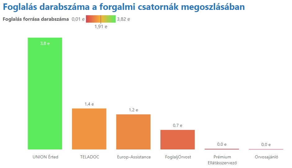
Service providers
general description
The Supply Managers view shows data related to traffic channels. The aim of the view is to provide a consistent panel of the major patient journey organizing channels of the healthcare market.
Statements
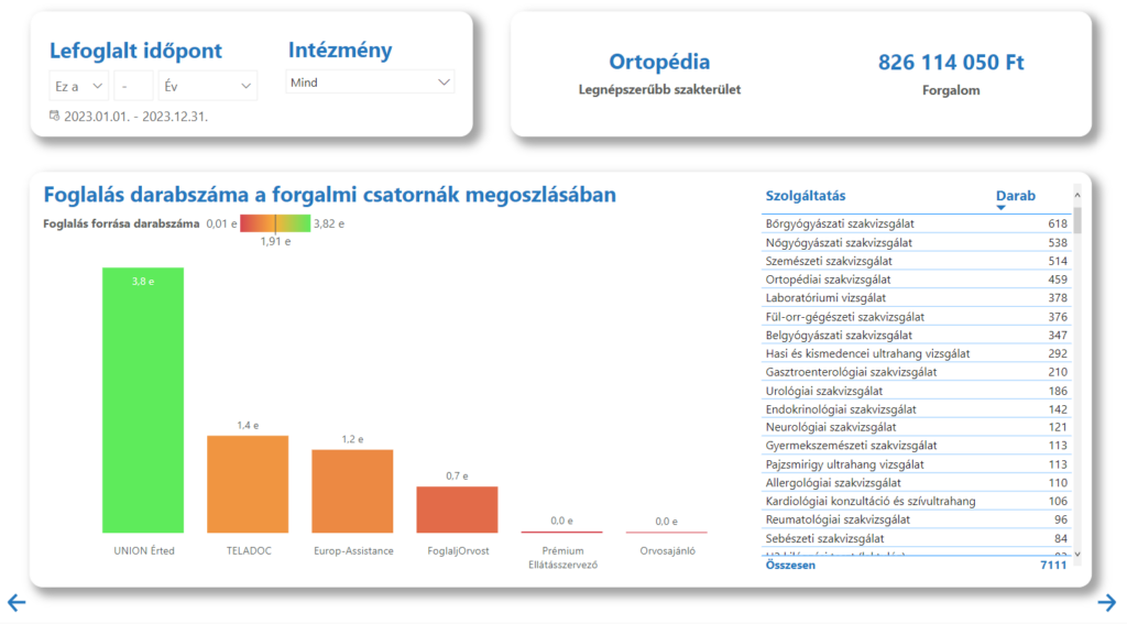
On this view, there is a diagram from which you can read the most popular field of expertise and the traffic for the time interval set with the date filter.

You can also see a table on which the names of services and the number of reservations corresponding to them are displayed.
The last element is a bar chart showing the number of bookings according to the distribution of traffic channels.
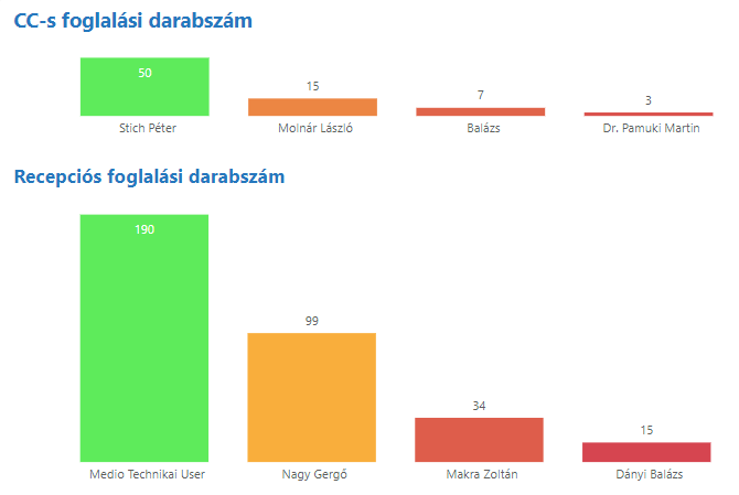
Receptionists
general description
The "Receptionists" view in VIR shows, in addition to general reservation data, the number of reservations received through receptionists. The view can be used to track the source of bookings and understand which receptionists are most effective in handling bookings. This makes it possible to improve work processes and make them more efficient.
Statements
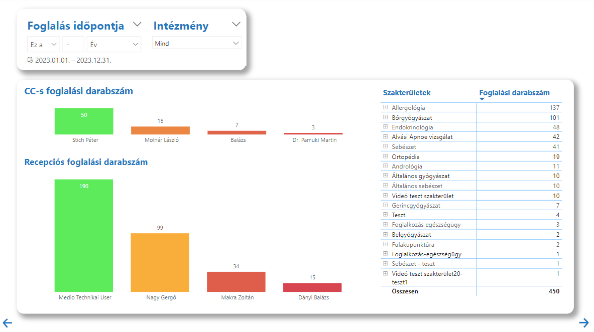
The two bar graphs shown in the view also show the number of bookings for the names of the CallCenter employees on the top, and the number of the receptionists on the bottom.
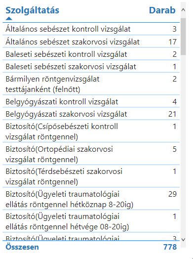
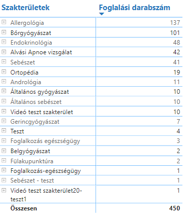
In addition, there is also a matrix table on the page, which explains how it works here you can read, this table shows the fields of expertise, the names of the tests corresponding to them and the reservation numbers.
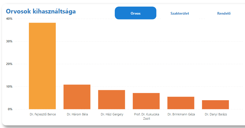
Utilization
general description
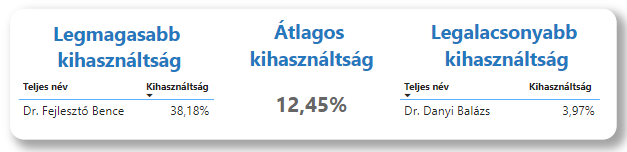
VIR's "Utilization" view is used to view the utilization of doctors, specialties and test locations. This information helps to make better use of empty time windows and to better organize work and optimize resources in later periods.
Statements
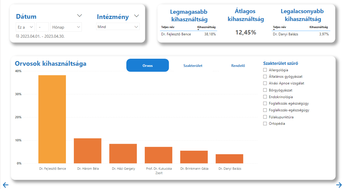
The main report on the view is a bar chart, with utilization on the Y axis, and on the X axis the names of the doctors, the specialties, or the names of the clinics (if they are specified), depending on which of the buttons for the chart you select Who.
What data is displayed in the upper right figure also depends on these buttons, if the "Doctors" button is active, it shows the doctor with the highest and lowest utilization and the average utilization, the highest for the "Specialty" and "Practice" options and displays the specialty or clinic with the lowest utilization.
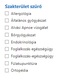
In addition to the usual date and institution filters, the view also includes a specialty filter. This filter only appears when the "Doctor" option is selected on the buttons.
Reservation Properties
general description
The "Booking Properties" view is used to display information about how far in advance patients book, i.e. what booking distances they have.
Statements
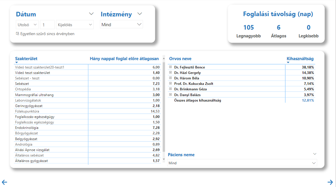
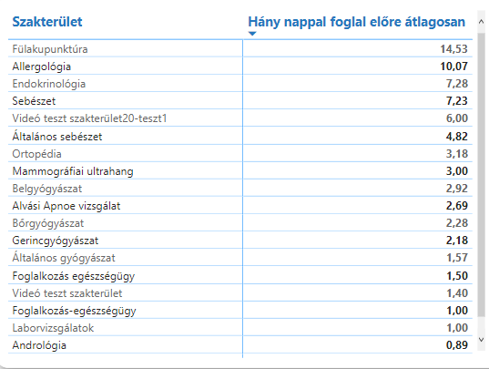
The view primarily contains a table showing the specializations and the corresponding average booking distance.
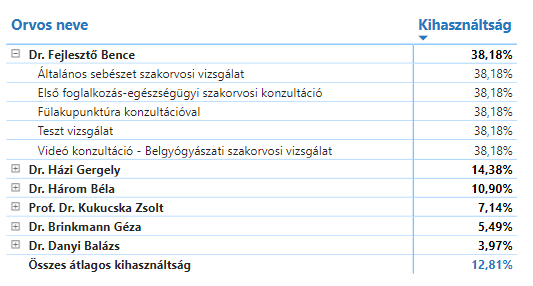
The next element is a matrix table, on which you can read the names of the doctors, their associated examinations and utilization rates. About the operation of matrix tables here you can read more.

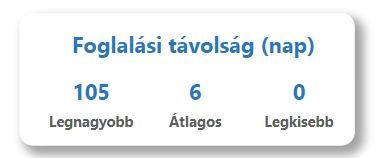
The diagram in the upper right corner shows the maximum, average and minimum booking distance calculated in days.
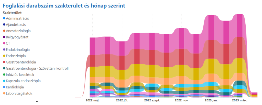
Seasonality
general description
The "Seasonality" view in the VIR system is used to analyze annual seasonal trends. It displays data by month and allows users to make year-over-year comparisons of examinations and earnings in each month. This information can help healthcare providers develop business strategies and serve seasonal needs.
Statements
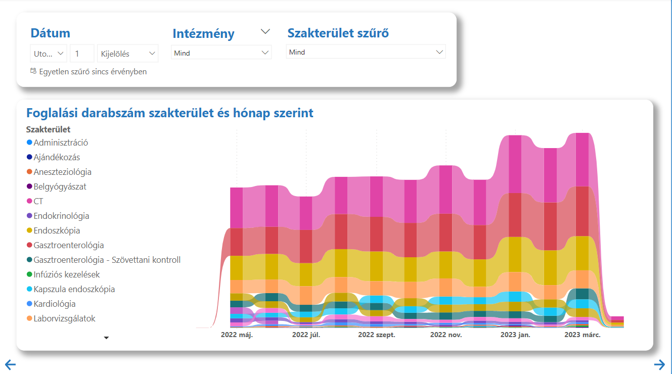
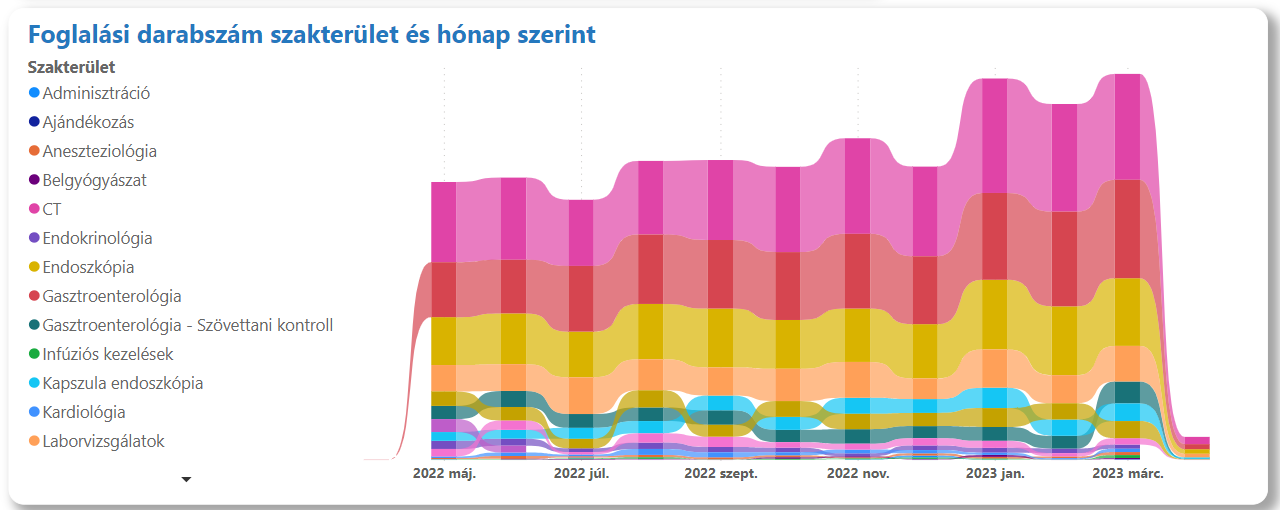
The main element of the view is a ribbon diagram, on which the number of bookings belonging to the specialized areas and their changes can be read, broken down by month. In addition, the usual filters can be found on the page.
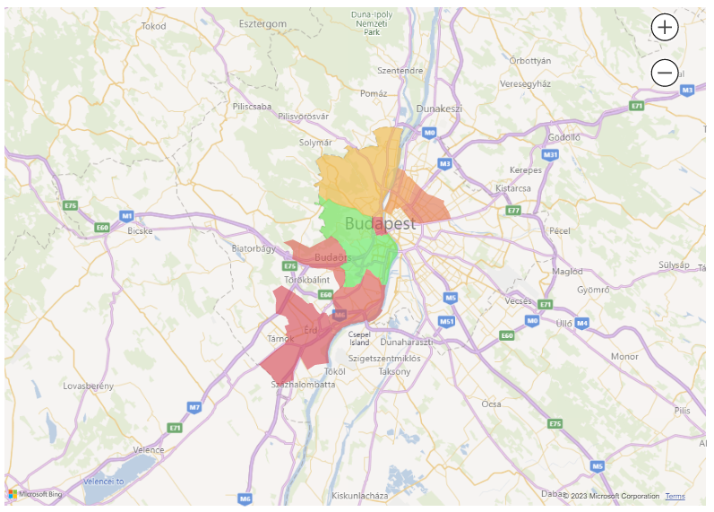
Patients
general description
Based on the booking data, the Patients view shows the booking activity in each city or district. It also shows the average age of the specialties and the average age of the examinations. The data can be further refined with the help of gender and institution filters. The view can be useful in making marketing and design decisions, as well as in planning targeted marketing campaigns.
Statements
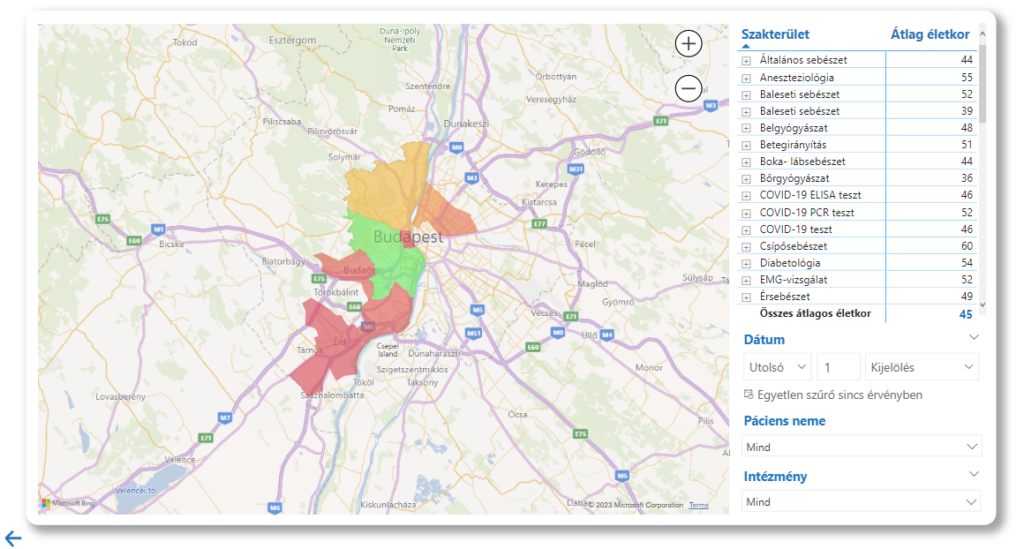
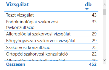
The view shows a map showing the first ten areas according to the number of reservation units. You can get more information about the given area by dragging the cursor over the map.
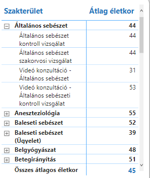
The view also includes a matrix table on which you can see the specialties, the names of the corresponding examinations and the average age of the patients belonging to them.